Crafting Spaces: My Approach to Interior Design

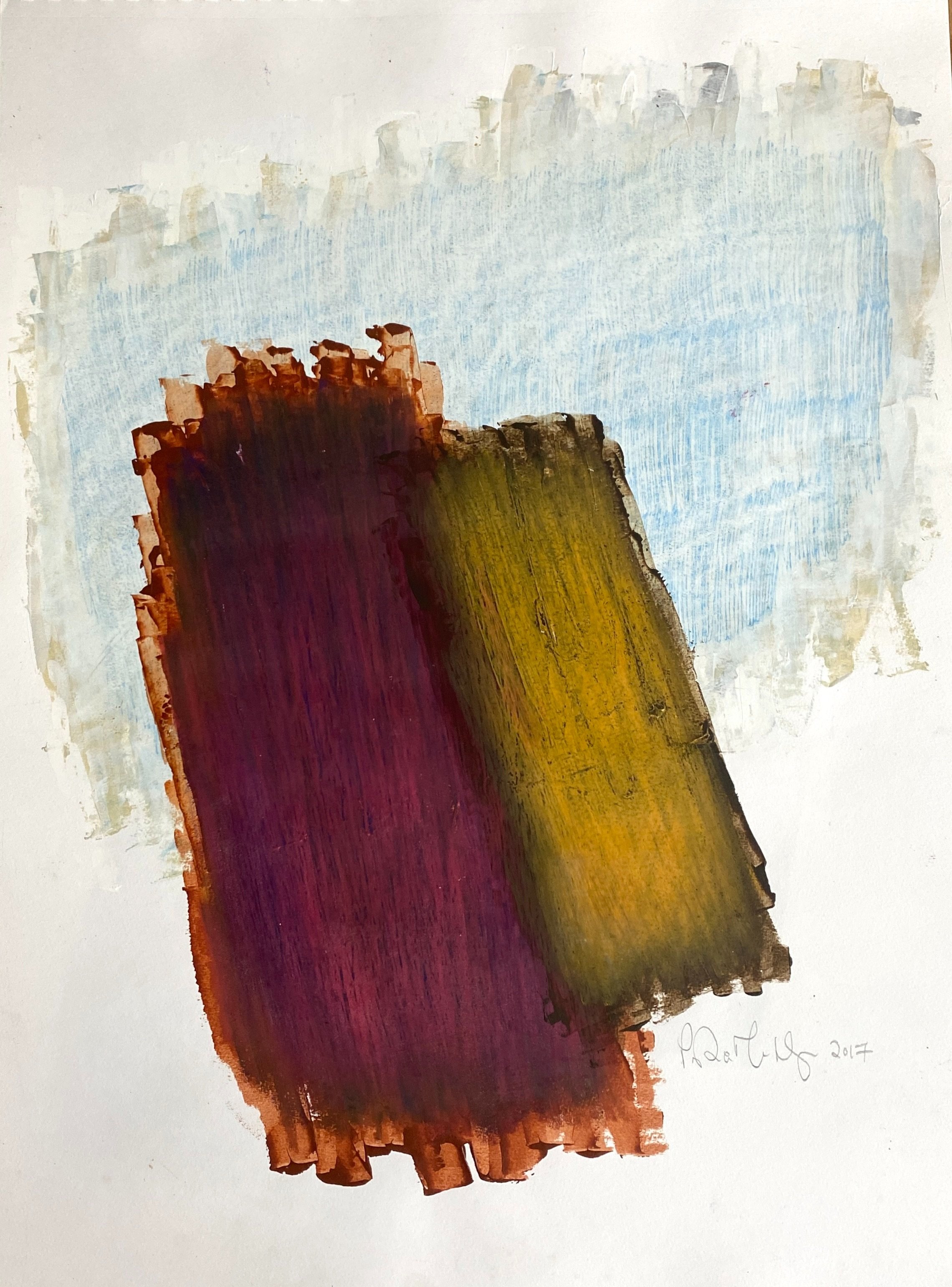
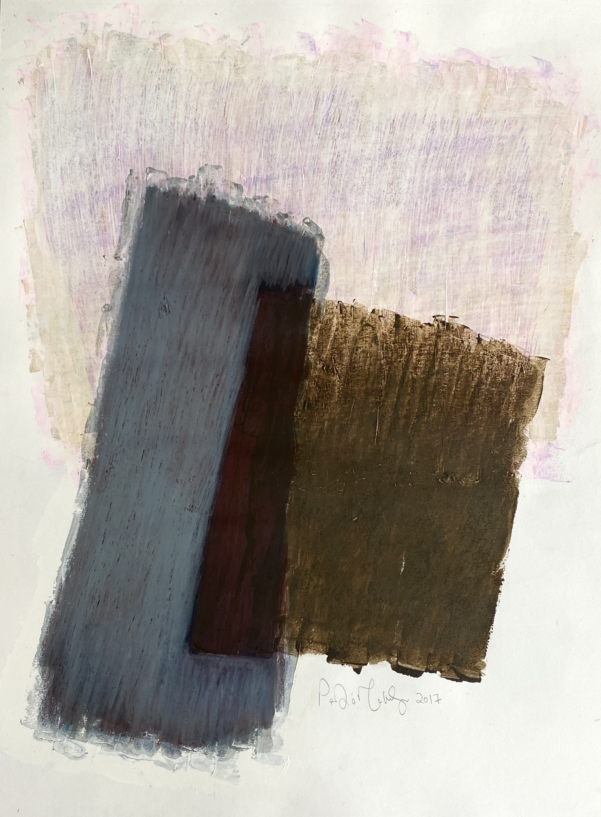
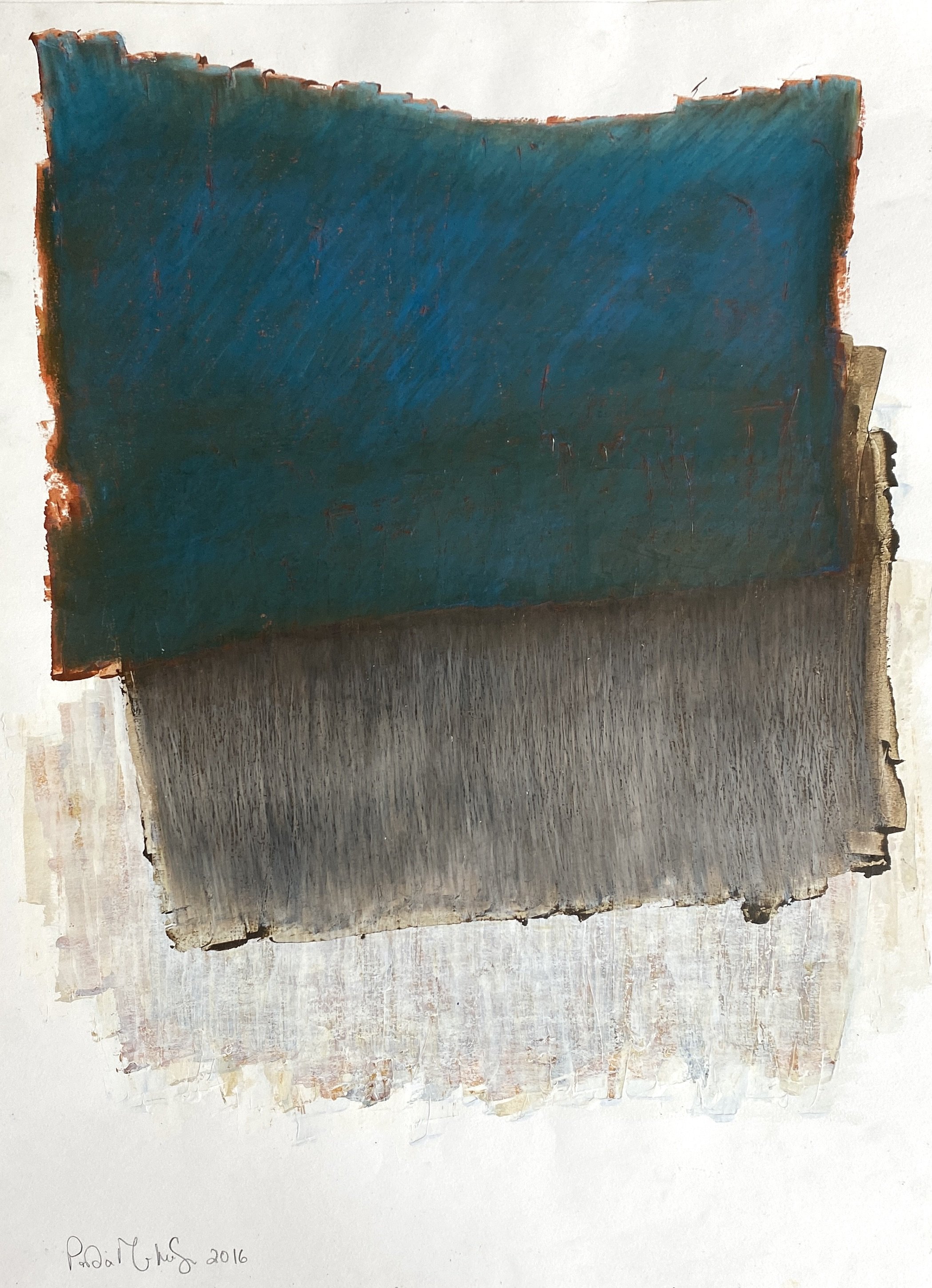
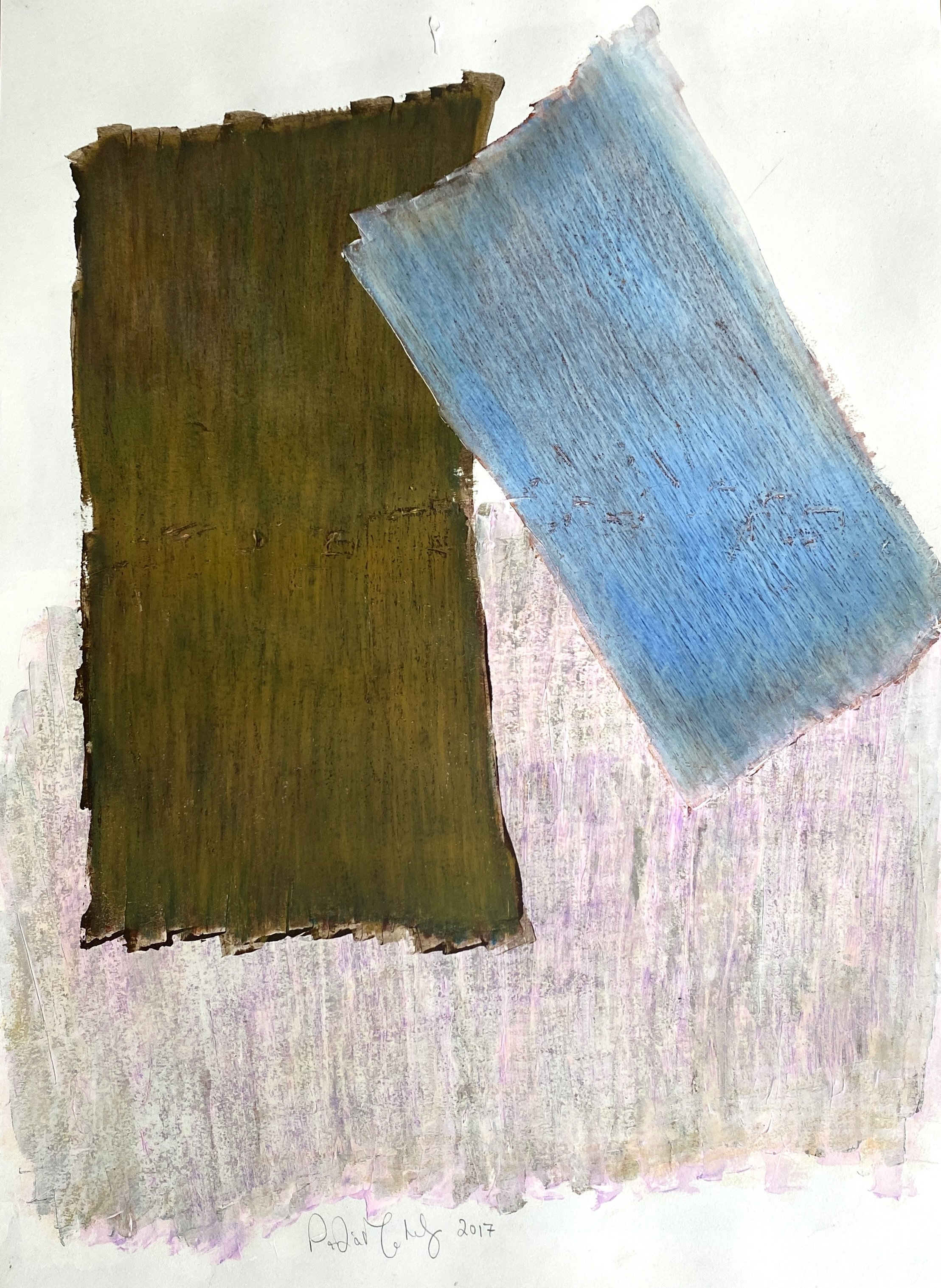
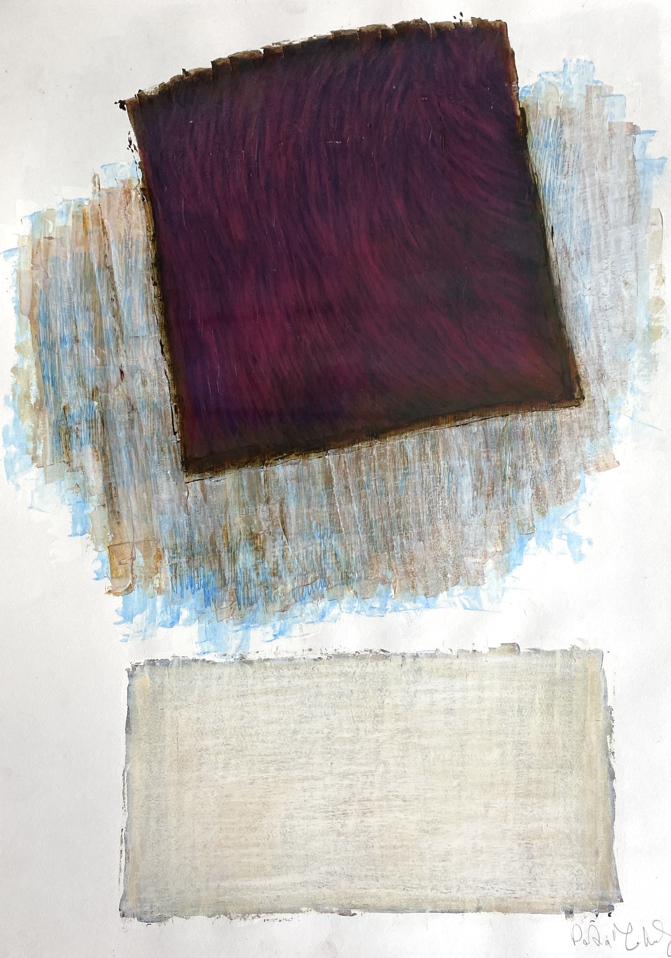
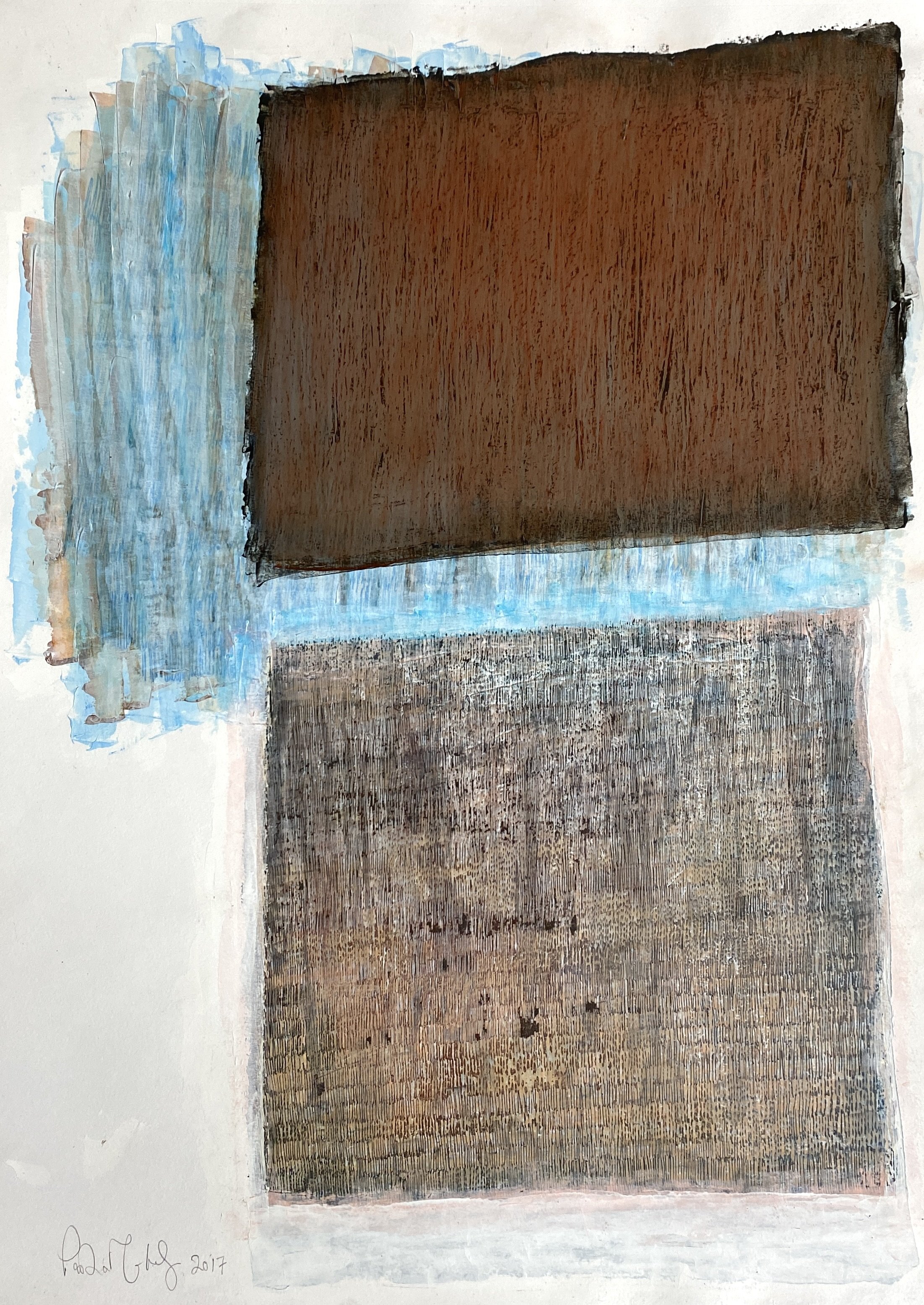
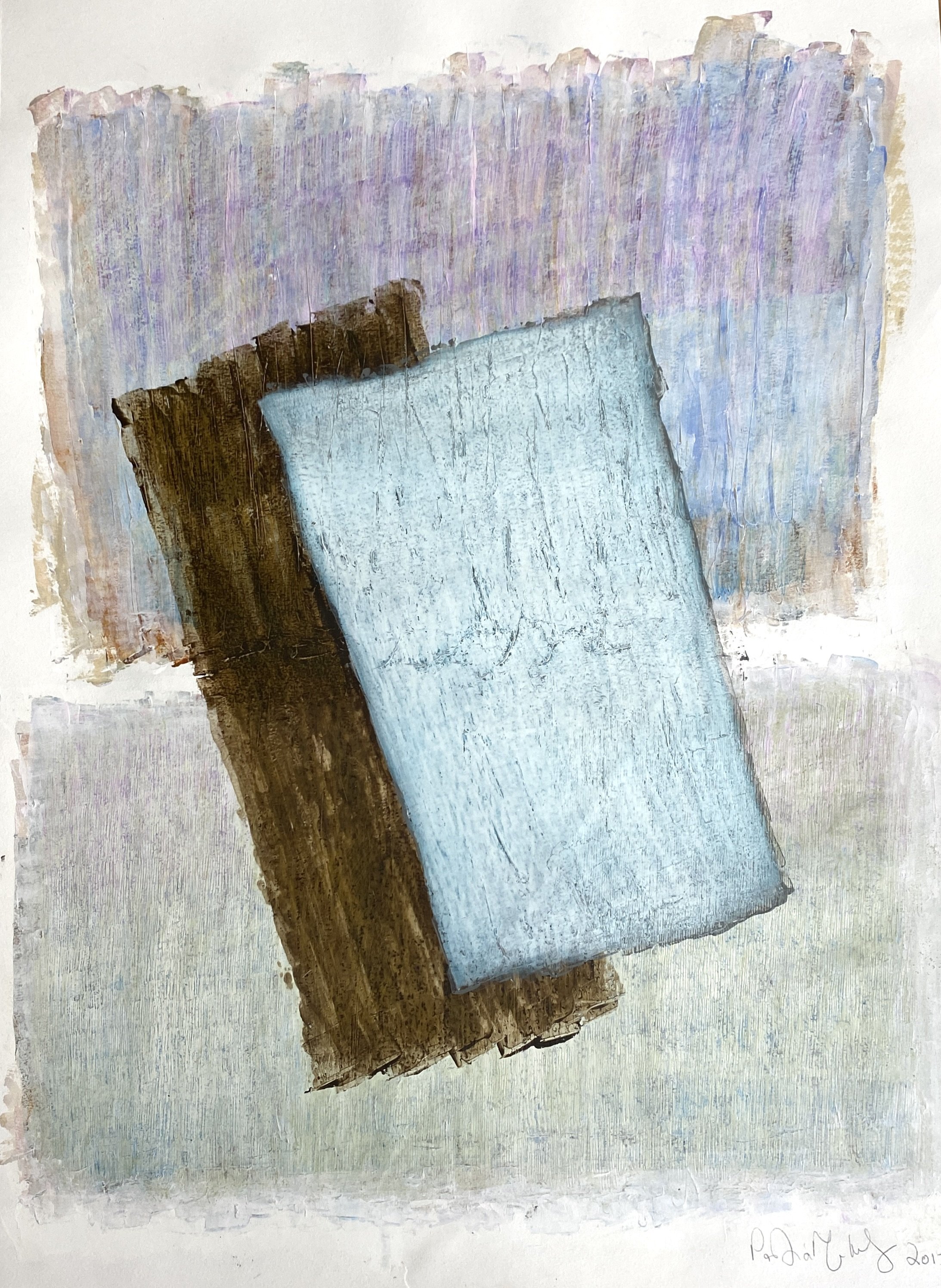
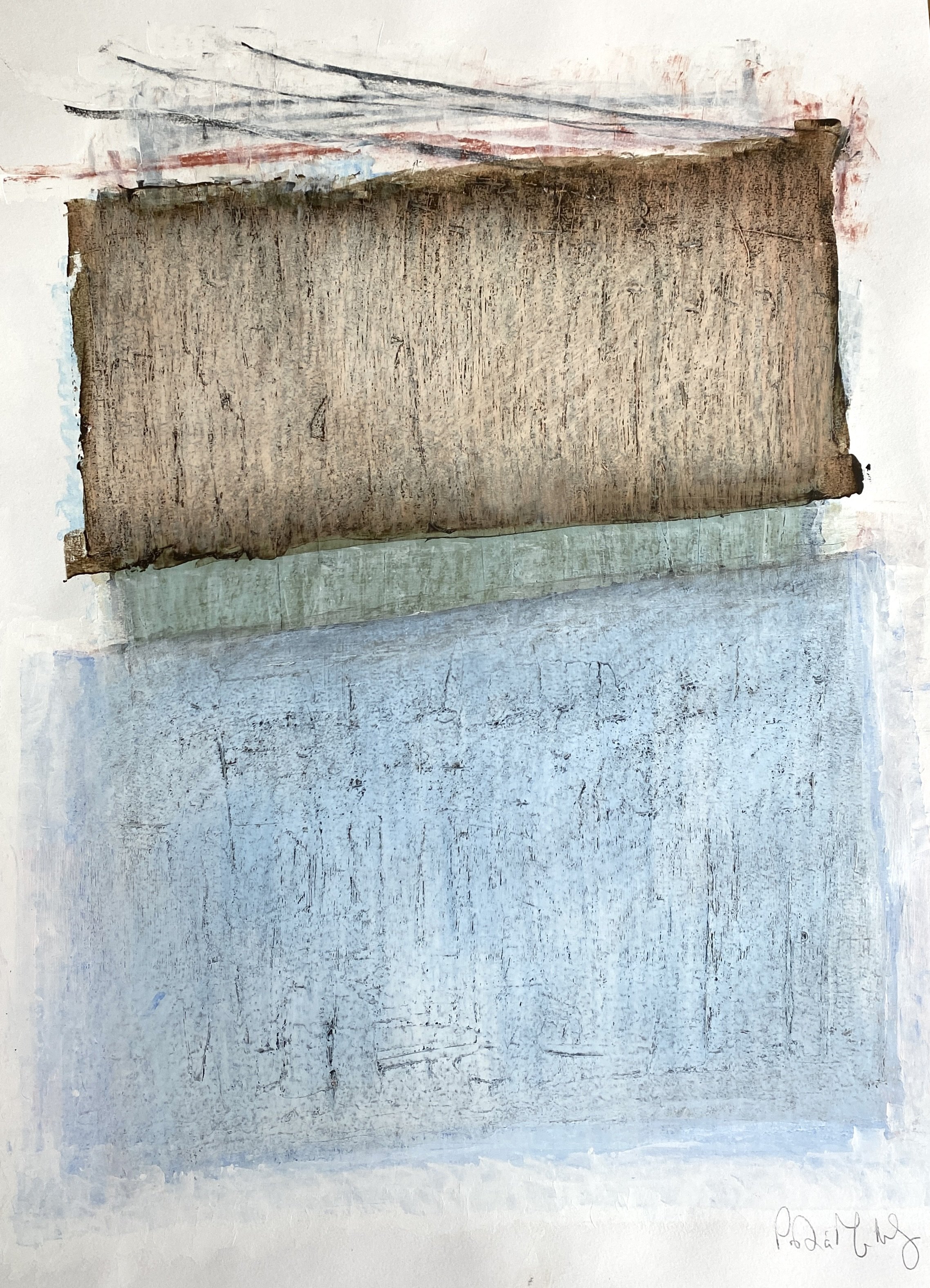
When I envision a space, I see it as more than just a room—it's a canvas awaiting transformation, a piece of art waiting to be arranged like a composition. My approach to interior design revolves around the belief that while functionality is paramount, achieving balance in form, color, and texture is equally essential. Each element contributes to the overall harmony of the space, creating an environment that is not only aesthetically pleasing but also deeply engaging.

Form is the foundation upon which I build my designs. Whether it's the clean lines of modern minimalism or the intricate details of classical architecture, I believe that every space should have a sense of purpose and intentionality. Each piece of furniture, every fixture, and all the architectural elements work together to create a cohesive whole.

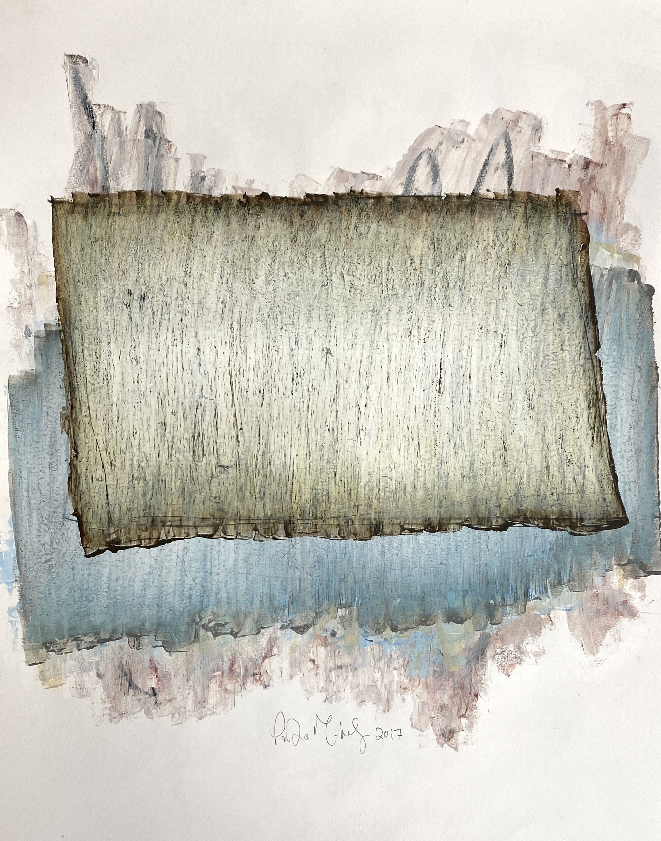
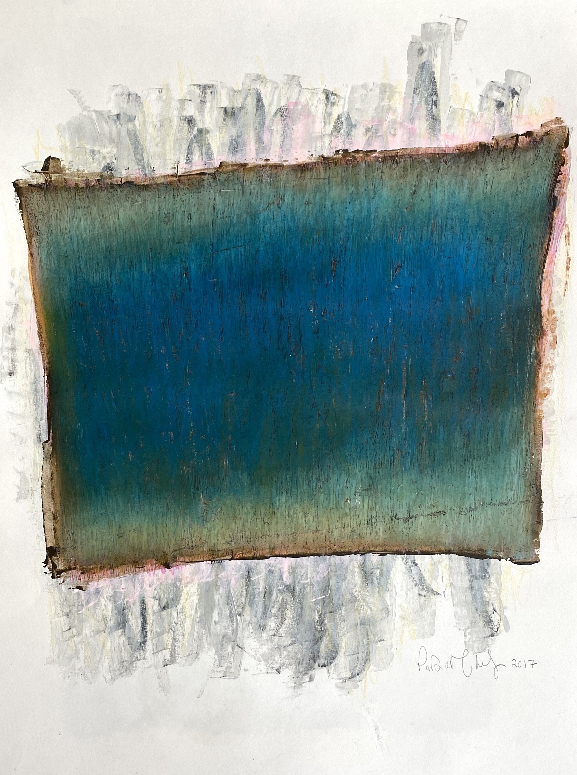
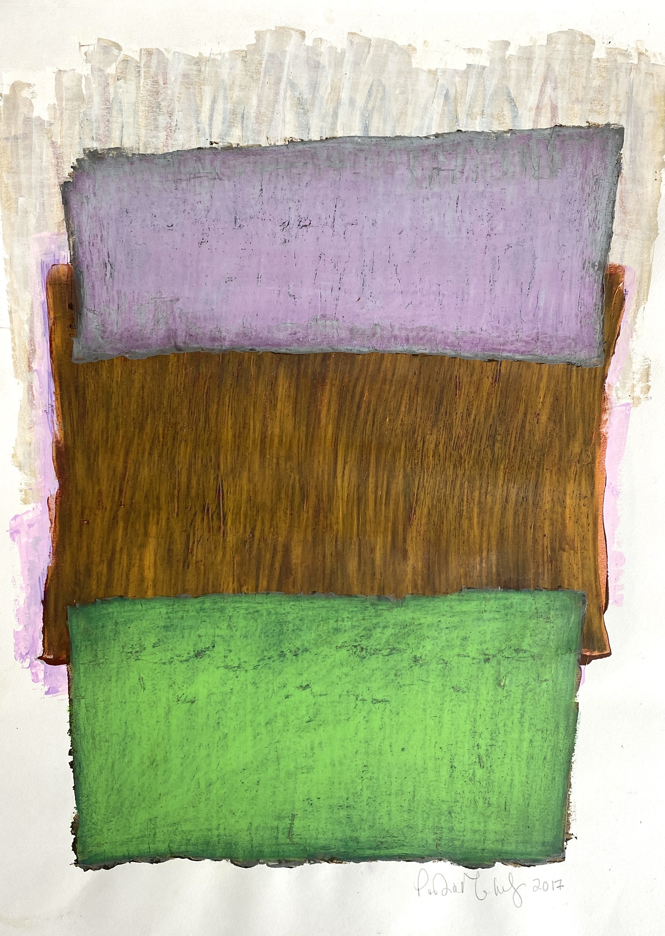
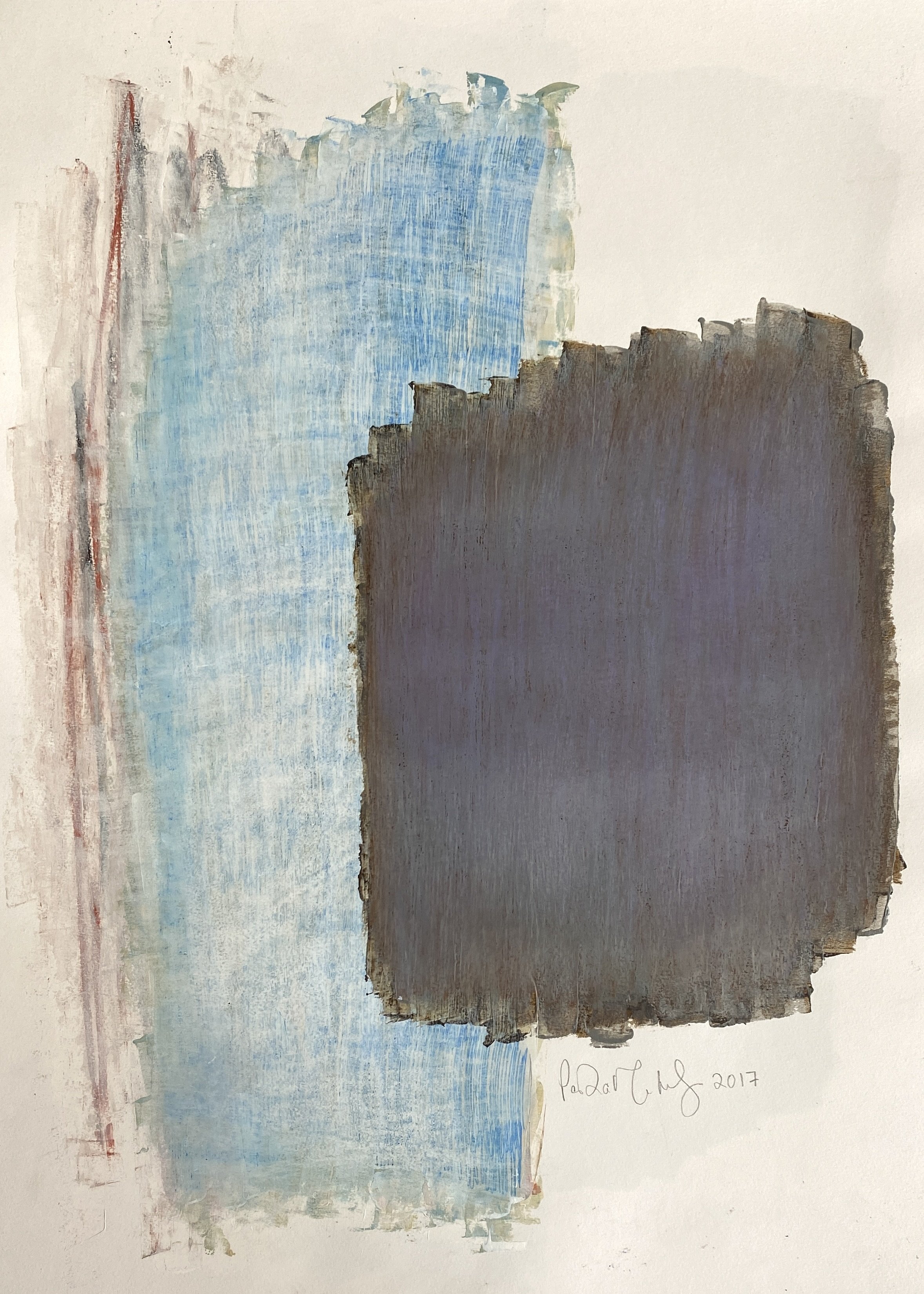
Color is where I inject personality and vibrancy into a space. I approach color palettes with careful consideration, understanding how different hues can evoke various emotions and moods. Whether it's a calming palette of soft blues and greens for a serene bedroom retreat or bold pops of color to add energy to a living room, I aim to create spaces that not only look beautiful but also feel harmonious and inviting.

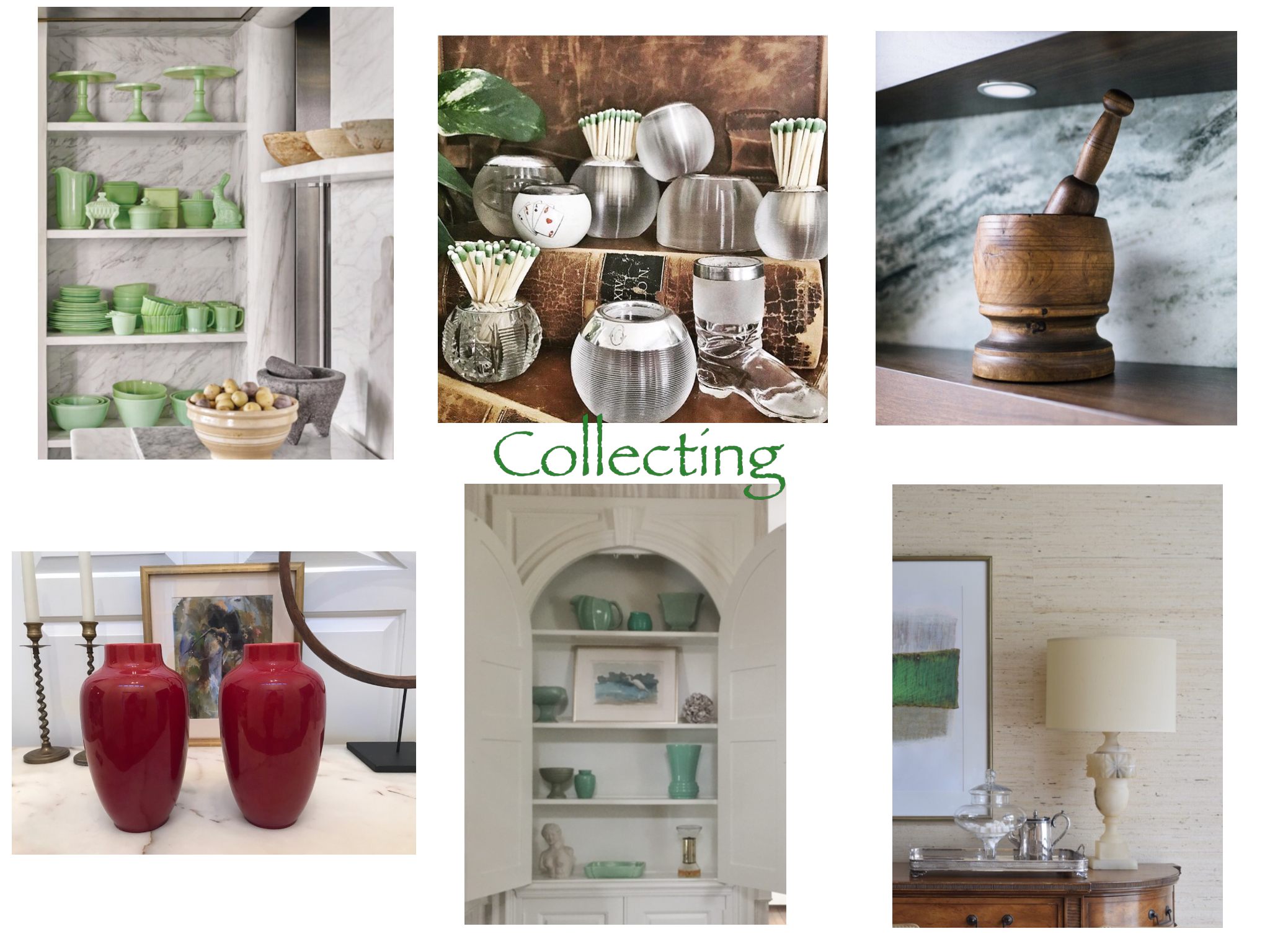
Texture adds depth and richness to a space, turning a flat surface into something tactile and dynamic. From plush rugs to sleek metallic finishes, I love incorporating a variety of textures to add visual interest and dimension. Mixing and layering textures not only creates a sense of warmth and coziness but also adds an element of luxury and sophistication.

Above all, my goal is to create spaces that are not only visually stunning but also functional and livable. A beautifully designed room should enhance the lives of those who inhabit it, providing comfort, inspiration, and joy.

Artist Portia Mortensen, Works on Paper

 
portia mortensen abstract painting

Portia Mortensens’s works on paper from 2015-2017 are notations on the landscape that inspires her. The collection, called I Can Hear the Earth Breathe, consists of 30 works in acrylic and cold wax.

I recently acquired these works and all are available to purchase. Please follow the links to my website to learn more about Portia and her life’s work. Feel free to inquire with me directly about any of the paintings.


Artist’s Statement

I would describe my paintings as ”notations of balance.” This series of paintings is inspired by 3 major influences: the canopy of color suspended through the change of season in my adopted home of Pennsylvania; my relationship to the horses I train and learn from everyday; and the concept of visual pattern that is found in the written language.  These influences all converge to determine the feel, movement and content of each piece.

Moving from Zimbabwe, Africa to the east Coast has opened me up to the generosity of color offered by the seasons.  This ever-changing suspension of color influences my painting at its core level.

My other passion in life, dressage, is about balance, cadence, tempo, and rhythm. All  of these elements are central themes of my work.  In riding and in painting, the artist has to work through a set tonal structure and trust her instincts to find her way out of a maze of infinite possibilities.  A painting is a living thing, and like a horse it must be listened to.  I often consider a painting finished when I can hear it. 

The visual pattern found in written language is a concept I am intrigued with.  Be it calligraphy, sheet music, a page of Braille or something as simple as a shopping list.  In an abstract sense there is an ebb and flow of characters on the page, a balance and rhythm between positive and negative shapes.  In a parallel yet more literal sense “reading between the lines” there is often more importance in what is left unsaid.  And so I ask the viewer to really look, what is the subject matter, the rocks, circles, or squares; or the foreground?  The illusion of space or dimensionality? The putting on, or taking off  of paint? That which is erased, or that which is evident?”

Source: http://www.walshhilldesign.com/journal

A Pink Christmas

A repost of last year’s holiday card, because I was more clever last year. I didn’t realize then what I know now. My first baby granddaughter was on her way and it’s been pink ever since!

It was love at first sight. Ironic because I don’t really love Christmas. And I don’t really love pink.

But I fell hard for this painting and had to have it.

Maybe I do love Christmas and maybe I do love pink. Or its 2020 and everything is backwards.

Wishing you all good cheer and many blessings this holiday season!

-Lisa

Brotherly Love

I had SO MUCH FUN working on a kitchen renovation for my brother and his wife! I am especially partial to the ( well stocked) hidden bar faced with my other brother’s photography.

from Maine Home & Design, February 2020

from Maine Home & Design, February 2020